How to use the user's mental-models to create excellent UX

Two years ago, I learned a valuable lesson about creating good UX:
It might not seem intuitive, but sometimes users prefer the less straightforward UX
At this time, I was building the first version of a new cross-platform app called Skiwise. I thought I was creating the best experience possible, but as I later learned, straightforward doesn't always equal intuitive.
This is the story of how I learned this lesson, and how these learnings can help you build better software.
It's confusing?
Skiwise is an app that lets cross-country skiers access crowd-sourced reports on the trail conditions of various ski trails. This lets them decide where to ski on a given day and what skis/wax/clothes to bring with them. You can think of this as essentially "the weather app for cross-country ski trails".
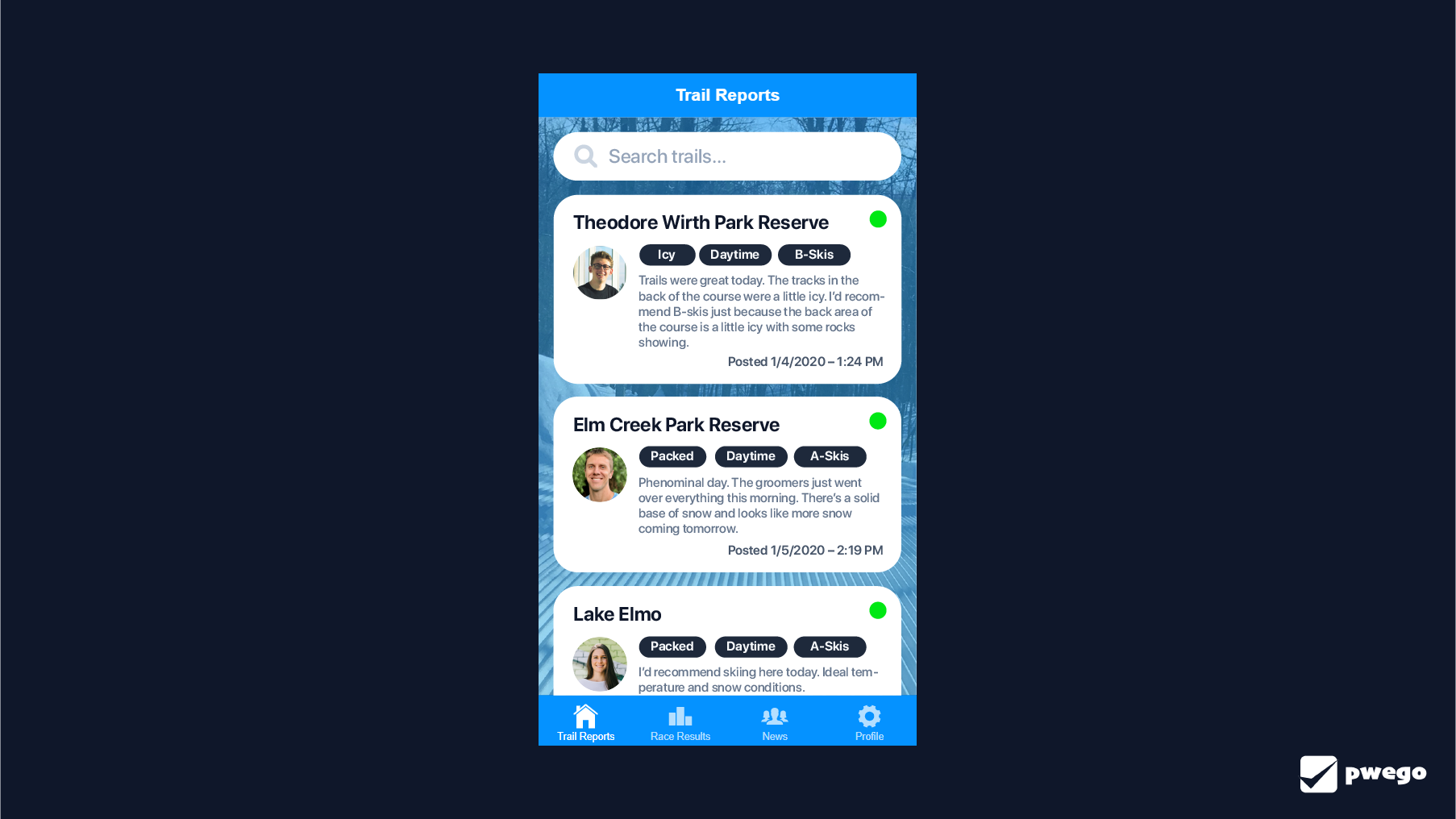
With the goal clear, the initial version of the UI looked something like this:

As you can see, the main page contains a list of trails you follow and displays the most recent trail report from each trail. "This is great", I thought at the time, "The info is instantaneous! You can browse the newest trail reports in 2 seconds! There's no friction! People will love this!".
And the result? People didn't love it.
So, I went back to the basics. And there's nothing more basic than watching users interact with your app. But, it wasn't until I put the app in the hands of my Mother that I discovered the problem.
She loaded the app, got to the home screen, scrolled a bit, stopped, scrolled some more, stopped again, then looked at me and said "what now?".
And that's when I had the "aha moment".
See, I'd made the information so readily available that it left the user no desire to dive deeper. It took away all the exploration. It's like being handed a solved Rubix cube. There's no clear direction, no problem to solve, and no task to be accomplished.
And, the way this information was presented didn't line up with a user's mental model. It was hard for people to conceptualize that the feed was showing the most recent report for favorite trails in order of report date.
This is similar to having a list of the most popular book by each artist sorted by the book's release date. It's just a complicated set of relationships to think about.
Simplifying things, by adding complexity
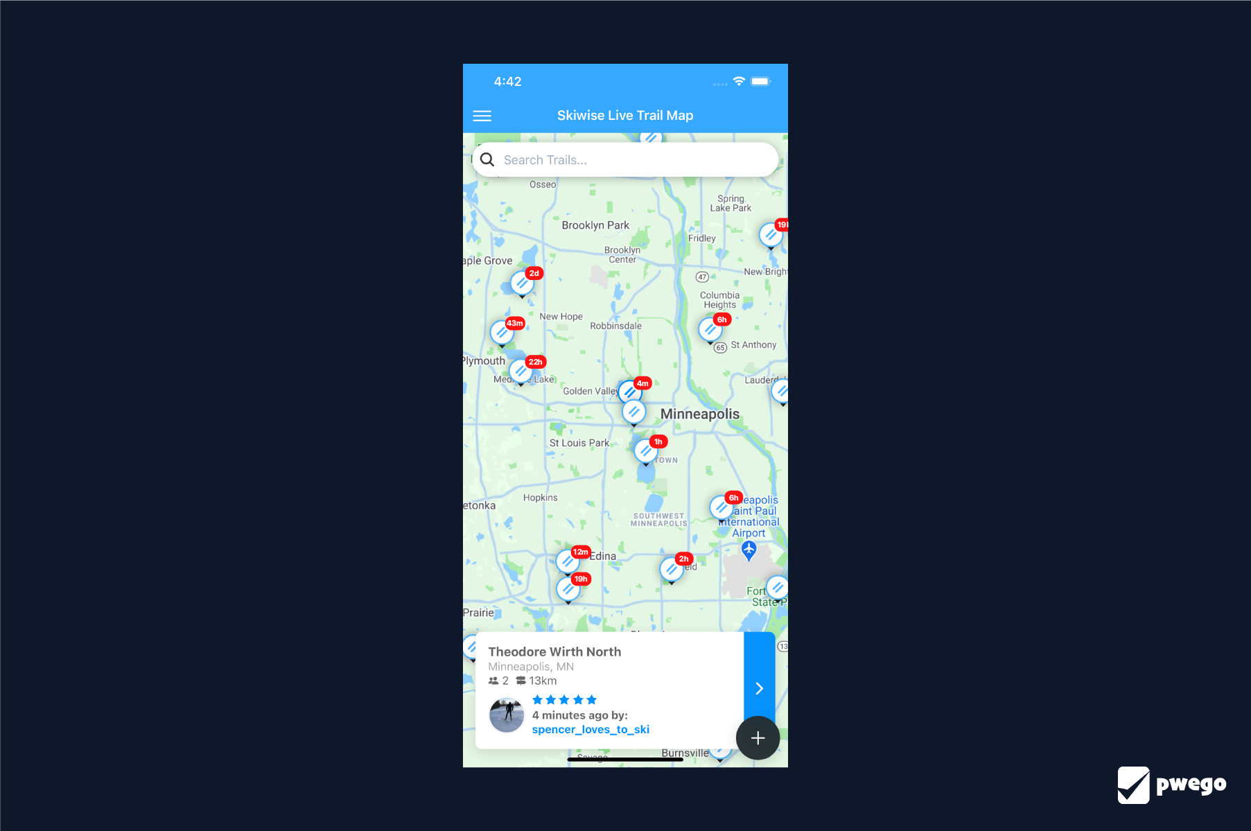
So, I changed the user experience. Instead of delivering all the information on the home screen, users now had to hunt on a map for it. And this dramatically changed the experience.

Now, instead of the info being discoverable instantly, it takes about 30 seconds. But, it lines up better with a user's mental model. When surveyed, 76% of users reported that they only skied at trails within 30 minutes of their home. This was a huge breakthrough.
It indicates that people place the highest priority on nearby trails, and don't care about trails far away from home. This points to a clear data structure – a map.
And, there's a certain satisfaction when you click on a map, find a trail, see a recent trail report, and get your answers.
So, despite it taking objectively longer for users to get their answers, they loved it.
How you can apply this?
The key is in mental models. If you think about it, every app comes with a set of mental models and interaction patterns that users will intuitively follow.
For example, when you use Instagram you quickly learn that posts are attributed to users, with no exceptions. This becomes a core mental model of the app. It helps everything else become intuitive as well. You learn that comments are attributed to users. And posts can be clicked on to see a user's profile. And your feed is just a series of posts.
So, say you have a software-as-a-service app. Write down the core mental models your users are using and use that to determine if your UI is intuitive. Does a user own multiple projects in their dashboard? Do settings belong to projects or users? Where should the settings button be located to indicate that?
From there, use something like Hotjar or Microsoft Clarity to watch your users interacting with your app. Do they see the mental models the same way you do?
Want some more tips? I wrote another article with quick fixes for 7 common SaaS dashboard mistakes. These can give you good hints on low hanging fruit that might be causing friction for users of your app.