7 Common SaaS Dashboard Mistakes — How to Fix
SaaS dashboards, like everything in life, are a compromise. They’re a constant battle between functionality and ease-of-use. And, like most compromises, they typically do a bad job at both things.
I’ve identified these mistakes and distilled them into one great article for those looking to dramatically improve the customer metrics through their dashboard. So if you’re interested, read on…
Mistake #1: Welcoming new users with… a blank login screen

Imagine, for a second, that your dashboard is a beautiful river that your hawaiian-shirt-wearing, pina-colota-drinking prospects are flowing down on their journey to become a customer.
As the prospect is sipping their drink and loving life, there will inevitably be a moment where they first experience friction.
For many apps, this moment is when they need to sign up and create an account. This moment of friction is essentially like telling your customer they need to portage over 100 yards of forest and hop back into the river on the other side.
Aka: It’s painful.
The problem, however, isn’t just in the act of authentication itself. It’s in the position we place this in the user flow. Greeting new users with a login screen might be essential, but can we give the user a taste of the value proposition before we make them sign in?
There’s many ways to fix this. The simplest would be embedding your sign-in form within the page. This allows the user to see the navigation and get a good feel for what they’re signing into.
Good:
Better:

But can we do even better? With this solution, the visible left navigation gives us a sense of direction. But, since the background behind the auth popup is blank it feels like opening a door to walk into an empty room.
Let’s make this more effective. This time, we’ll give the users a sneak peek of what’s behind the door before they enter.
You can create this effect by adding a combination of blur + partially-opaque black overlay to a “skeleton” version of your dashboard page. The result should look something like this:
Best:

This is great because it emphasizes that the solution is right in front of them. They just need to log in and access it. Plus, this gives the user a couple seconds to familiarize themselves with your dashboard layout before interacting with it — making it less daunting.
Mistake #2: Building out complicated onboarding “walkthroughs”

But, wait? Don’t onboarding walkthroughs help conversions?
The answer is: Yes. But, not the way most people do them.
See, most businesses make the same mistake here as they do with authentication. They tend to put the cart before the horse.
These walkthroughs, while helpful, do very little to guide a user because the user doesn’t have the context yet to fully benefit from them. It’s like teaching a 5th grader calculus.
You’ll know you have this problem when you see that a large percentage of your users are opting to skip the walkthrough.
To fix this, trim down your complicated walkthrough experience. Break it into smaller chunks that can be given piecewise. As they dive deeper, they unlock more walkthroughs similar to a video game.
Another tip: display your onboarding walkthroughs after a short delay. Only 5 seconds or so. This way the user gets a chance to see, feel, and interact with the page before being shown the happy path.
For another great solution, look at a company like Retool. Retool created a dedicated “Learn” tab for customers to seek out tutorials as they need them.
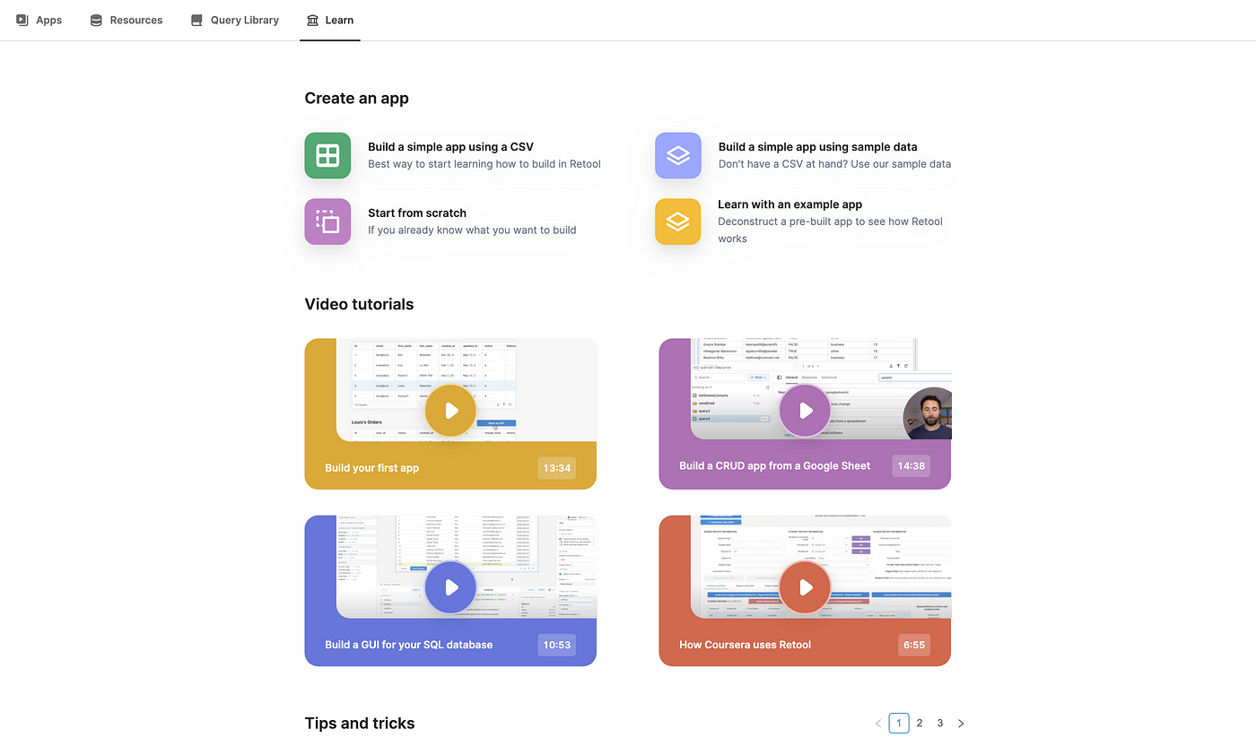
The “Learn” tab means walkthrough content is always accessible in the future. Plus, for a more complicated product (such as Retool’s), it offers great expandability as new features are implemented.
Mistake #3: Having “promo codes” in the checkout experience
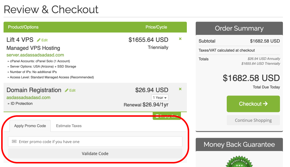
This is another common, but sometimes costly, mistake. Think about it, you’ve been using an app for a while and you’re finally ready to move to a pain plan.
You’ve accepted the price
you’ve gone to the checkout page
You’ve entered your credit card
…and you see a text field for “Promo Code”. What’s the first action you’re going to take?
You’re going to navigate away from the checkout window and search google for “AppName Promo Code”!
Now, why would you want to push your bottom-of-funnel back to google? There’s a risk here that your competitors could buy out this keyword and target your customers to bring them to their solution instead.
Or, it could just lead to the prospect delaying their purchase because now they’re not too sure if they’re getting a good deal. Finally, your best customers aren’t going to care about a discount code anyways. 10% or 20% off won’t matter to them, so don’t even present it as an option.
Here’s a better alternative to promo code fields: remove them entirely. Instead, keep the functionality by generating custom checkout links with the promo-code pre-applied. Then, share those links instead of the code. This way, you can use these links for affiliates, or discounts, but not confuse your “normal path” customers.
Mistake #4: Allowing customization too early

Ultimately, customization is the goal of any SaaS dashboard. Think about it, if your SaaS didn’t need customization it wouldn’t be a SaaS. It would just be a service.
Therefore, it’s important that you balance too-few-features with too-many-customizations. Customization might be great for your current customers. They know your tool already and extra features won’t be distracting. But, for new customer it raises the knowledge barrier to entry.
One easy solution: Create a clear onboarding flow that only introduces the essential features. Then, have the full dashboard experience with all the customization available later.
Mistake #5: Not supplementing your dashboard with smart behavioral email

How long will your new trial spend on your dashboard on their first visit? A minute? 5 minutes? 20 minutes? No matter how long they spend, they’ll always navigate away.
That’s why behavioral email is so important. Behavioral email is a type of automated email sent in response to an action (or lack of action) by a user. This can be used to incite the user to continue to the next step in their onboarding flow.
With smart behavioral email, you can create an email flow that tracks where the user is in their “Minimum Path to Awesome” process, and gives them guidance on moving to the next step.
Has someone just created an account but not done anything?
Send them an email reinforcing the pain point your product solves and inviting them to run a simple test to see if the tool works for them.
Has someone created an account and tried a couple simple tests, but not fully committed?
Send them an email inviting them to a 1-on-1 call to discuss their specific use-case. Also show off how others are using your tool to benefit their businesses.
Has someone used your tool to solve their problem, but hasn’t upgraded to a paid plan yet?
Send them an email reiterating the value they’ve already gotten from your tool. Then, invite them to upgrade to the paid tier and focus on the extra value that can be provided at that level.
Why is behavioral email so valuable? Because it’s smart.
It essentially answers the user’s questions before they even ask it, because you can track events to figure out exactly where a user got stuck while using your tool.
There’s many great ways to implement this with Drip, UserList or other tools. Alternatively, you can implement your own. This is a feature we’ve built with great success at Pwego.
Mistake #6: Failing to create a comfortable “home” in the dashboard

You have to remember that every page of your dashboard has a specific “weight” to it. We feel this weight as humans, even though it’s a bit hard to quantify.
These weights exist in real world spaces too. If you arrive in your house, the kitchen, living room, spare closet, and bedroom will all have different weights to them.
This should be taken into account when building your dashboard. A common issue businesses fall into, is treating all pages as-if they have the same weight. This isn’t intuitive to a user, because it creates decision fatigue whenever they want to find something.
Imagine you see the following pages in a dashboard:
“Forms”
“Analytics”
“Users”
“Automations”
Does it seem like there is a clear “home”?
Ideally, the goal would be to have a clear “home” page that has a definitively stronger weight to it in the user’s eyes. You can do this by adding a tab named “Home”, “Dashboard” or “Create” and emphasizing it as the homepage. This makes it a very clear entry-point and helps users find the most important things quickly.
Mistake #7: Not watching your customers use your app!

Ultimately, this is the most important mistake on this list. All the other common mistakes were found from one thing: watching customers onboard.
A great way to do this is set-up onboarding calls with new users where you simply watch them as they sign-up and note where they get confused. You’ll find many things that you once thought were intuitive actually aren’t.
One time, I found that a user couldn’t figure out what to do because they needed to scroll down to submit the sign-up flow and create an account. That was intuitive to me, but not to all customers.
Setting up onboarding calls is great, but another alternative you can try is something like Microsoft Clarity or Hotjar. These tools anonymize and record the screens of users as they interact with your dashboard. Think of it as beefed-up google analytics. Plus, they’re completely free. So worth the try.