The Best Design Pattern for Managing Forms in React

Ughh… why does form code in React always get so messy?
It starts out simple: a <form> component, a couple input fields, and a submit button. But soon things get a little more complicated.
You think, “hmmm.. I want some more validation for this zip code field”. So you add a custom workaround that validates the data in the input field.
Then, you think “I want to disable the submit button when the form is submitting”. So you create another custom workaround that keeps track of what’s submitting, and when things are complete, etc.
Then, you think “I want better error handling”. So you add yet another workaround.
And over time that simple form balloons into a 400-line long super-component with multiple useEffects, useStates, and custom logic to handle all the edge cases.
Sound familiar?
I’ve had this trouble more times than I’d like to admit. So 6 months ago, I decided to double down and find the solution. I wanted to know:
What’s the absolute BEST way to manage forms in React so they’re organized, performant, and easy to debug?
That’s what I’m going to share here today.
Firstly, a form library — do I need one?
I’ve come at this crossroads before. As a project is small the answer usually starts as “nah”, then over time it inevitably sways towards “please, please yes”.
So now, I advocate for form management libraries no matter what scale of project. Form libraries usually have a relatively small bundle size and make a world of difference for code organization.
But, I should note: I’ve also seen custom form management work in the past.
The issue is that it’s really difficult. It’s possible, but even if you’re successful you’ll usually end up building a similar version of another form library except without all the great documentation.
That’s why I recommend starting your project with a good form library from the get-go. So that brings us to the next question.
What’s the best form library?
This decision making process could be a whole other article in itself. But, I want to focus on concrete design patterns today, so I’m only going to give a high-level overview of the landscape.
The Plethora of Form Management Libraries
The landscape for form management libraries in React is huge. But, luckily it’s concentrated among only a few popular libraries. Some of the most popular are: react-hook-form, formik, redux form, and react-final-form.
Here’s a breakdown of their popularity, with Formik as the most popular and react-hook-form chasing close on their heals.

As I already mentioned, I’m not going to be deeply comparing these solutions in this article. But, if you want a great article comparing these, check out this great post comparing these libraries from Retool.
With that said, the two form libraries that I consider to be an excellent choice are Formik and React-Hook-Form.
Both provide hook-centric form management and have great documentation, active devs, and a healthy user base.
However, between these two, I tend to lean towards React-Hook-Form andI’ll explain why below.
Why React-Hook-Form?
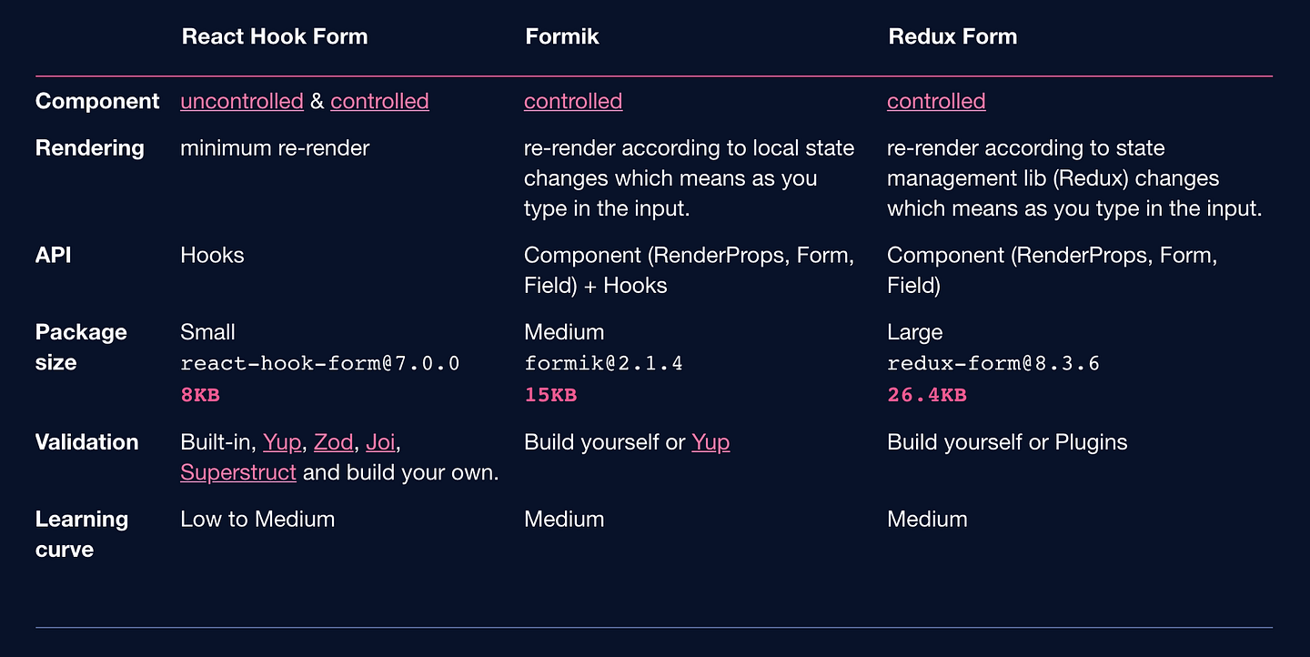
React-hook-form (RHF) is great because it prioritizes hooks to manage your form state (hence the name). This makes it fast, flexible, and a breeze to work with if you’re already using hooks.
Among it’s various benefits, one advantage over Formik is that react-hook-form was created exclusively for hooks. This means, although react-hook-form can’t support class components, their docs and best practices are more focused. If you look up articles online, you won’t find a lot of outdated guides with old design patterns. I find this extremely valuable when trying to learn a new library.
They also have numerous other small performance, bundle, and flexibility advantages over the other libraries. Here’s just some examples:

That’s why I chose React-Hook-Form. However, if your codebase uses a lot of class components you might be better off going with Formik as it’ll be easier to integrate into your components.
The design pattern: The 3 Layer Approach

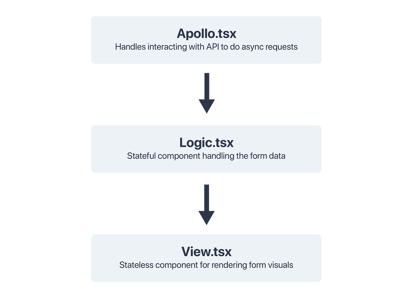
The basic premise of the 3 layer approach is to take a complicated form component and split it into three parts.
Each part will be its own react component and will focus on one responsibility of the form (see: SOLID). Each part will also be named with a suffix (Apollo, Logic or View), which will make it easier to find.
Here’s an overview of what each component does:
Apollo Component
This component handles strictly the network requests for your form (aka. fetching the initial data for the form, and submitting the final data to your backend). It’s named “Apollo” because I typically use Apollo to talk to my GraphQL backend. Feel free to use a more relevant suffix such as: “API”, “Network”, or “Fetch” if you prefer.
Logic Component
This handles the logic for the form. This is the component where you’ll define the shape of the form, default values, and validation.
View Component
This component renders the view of the form. It’s meant to be a stateless component. However, I usually allow view-related state in this component such as an isOpen toggle for an expandable section of the form or something similar.
The 3 Layer Pattern Further Explained
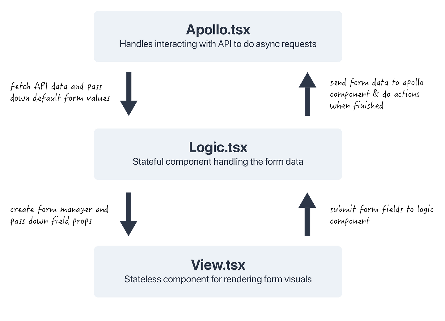
This chart shows how the data will flow between these three layers to create an organized form structure. Start at the Apollo.tsx file and follow the arrows to read how the data will flow through the components.

Let’s dive a little further into each of these components. I use TypeScript in this example, because it will help give a good look into the different types of data being passed around.
Also, here is the finished codebase. If you’re a hands-on learner feel free to play around yourself as you read.
CreateUserApollo.tsx Explained
The Apollo component is responsible for fetching form data over the wire. Here’s what it looks like.
There’s a couple things I want to point out about this component.
First of all, notice how the data fetched from the database is transformed before being passed down into the default values of <CreateUserLogic />. This is important, because in general it’s a good idea not to trust data fetched from over the wire. If you don’t do this it can go wrong in one of three ways.
(a) You can end up fetching too many fields from the API. This means your form will have more defaults than it needs. This can add clutter to your form and problems when we get to validation.
(b) This also safeguards against bad defaults (ex. undefined). Instead of trusting the backend, it’s a good idea to provide sensible defaults, such as the empty string, just in-case.
(c) It’s more robust. Notice how the user field from the API is transformed into the username field before being passed down to the form? This is useful for other fields too. Ex. parsing a string timestamp from the backend into a Date object for the form.
The second thing I want to point out is regarding the handleSubmit function. This function takes the submitted form data, transforms it into JSON for the API, and returns an async function for updating the database with the result.
Returning the async function is important. You’ll see this a bit later, but essentially it allows you to await the API response in your CreateUserLogic component which means you can know what the submission status of the form currently is.
CreateUserLogic.tsx Explained
The goal of this component is simple: set up the form with the default values, pass the form down to the view layer, then handle submitting the form to the parent component when the submit button is pressed.
The main thing I want to point out here is the handleSubmit function. You’ll remember that the Apollo component had a handleSubmit function too. Why do you need two of them?
The reason is to keep our three layers modular. The handleSubmit in this component lets you make state changes after a successful submission of the form. It doesn’t care how that data is submitted, it just cares about when it completes.
Trust me, I’ve tried doing it other ways and eventually you’ll realize this way is the cleanest. It lets you keep each layer from needing to care about what’s happening in the other layers and instead simply focusing on what they care about.
In this example, we reset the form after submitting. But, you can just as easily use this to route to a different page, show a success toast, close a modal, etc. This design pattern leaves it up in the air, which is good.
Also, it’s important that you either await or return the onSubmit(data) function. If you don’t, everything will still work but react-hook-form won’t know when you’ve completed the submission process and won’t properly handle the isSubmitting state of the form.
CreateUserView.tsx Explained
Finally we have the simplest component. This one simply renders out your form fields. Since you’ve done all the hard work in the layers above this component can be pretty simple.
This is great because in a large form this will usually be your biggest component. Additionally, this component only handles the “look” of the form and won’t deal with any logic. This is great because now you can easily hand this file off to a designer and the designer won’t need to care about how the form works, they only have to worry about how it looks. Which is great!
The benefits of this pattern
Ok, so I mentioned at the beginning of the article all my pain points when building forms. Not only does this structure solve all of those, it also has some other inherit benefits as-well.
1. ✅ Built in type checking and validation for every step of your form
If you noticed, the logic component contains per-field validation, and every step of this process has strong typescript typings. This makes it very hard to mess up and much easier to debug.
2. 🔍 Easy to find where things happens
Do you have an issue submitting data to the backend? It’s likely in the Apollo**component. Issue with the default value of a field? Logic component. Issue with the “look” your form? View component. Super easy!
3. 💨 Automated testing is a breeze
This is a commonly under-looked benefit of this pattern. But, if you notice, you can test the functionality of a form by passing props to the Logic components directly. There is no need to mock your backend at all since you can test all the functionality by bypassing the Apollo component entirely.
4. 🎁 Forms become much more composable
This means you can mix and match different layers to have the form behave differently. You can have different Apollo components submit form data in a different way (ex. editing vs. creating a document). Or vice versa, you can reuse an Apollo component for different forms to submit different data to the same backend services. Really cool!
5. 👥 Easy to Divide-And-Conquer for Teams
This structure lends itself well to working with a team. Your designer can work on the View layer, while the backend person can work on the Apollo component. Then, you can easily meet in the middle at the Logic component and get your new feature launched twice as fast!
And that’s the design pattern!
As you can see, by combining a good form library with a good design pattern can make messy form code a thing of the past. It allows for easier collaboration, cleaner development, and faster debugging. What’s not to like?
If you have any further questions or improvements, reach out!